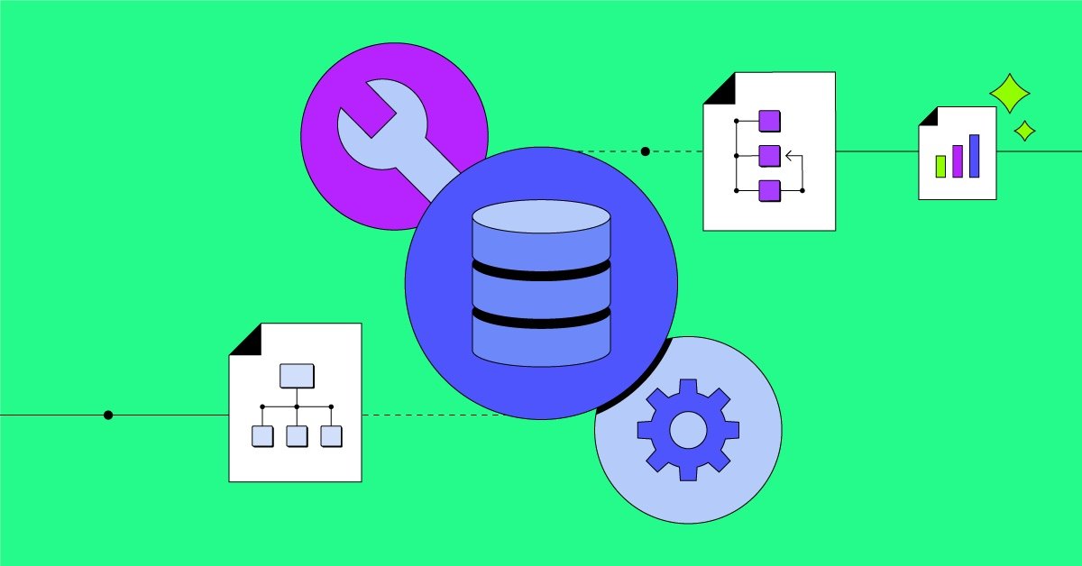
In today’s digital world, organizations are surrounded by massive volumes of data. However, data alone holds little value unless it is structured and communicated effectively. This is where data modeling and data visualization play a critical role. Together, they help transform raw information into meaningful insights that guide decision-making, improve business strategies, and foster innovation.
What is Data Modeling?
Data modeling is the process of organizing and defining the structure of data. It establishes rules, relationships, and constraints to ensure that data is accurate, consistent, and useful. A well-designed data model acts as a blueprint for how information is stored, retrieved, and managed within databases and information systems.
Key Types of Data Models
- Conceptual Data Model
- Focuses on high-level business concepts and rules.
- Often used to communicate with stakeholders in non-technical terms.
- Logical Data Model
- Provides a more detailed view of entities, attributes, and relationships.
- Independent of physical storage details.
- Physical Data Model
- Maps data structures to actual database implementations.
- Includes tables, indexes, and keys optimized for performance.
Why Data Modeling Matters
- Ensures data consistency and integrity.
- Reduces redundancy and improves efficiency.
- Simplifies complex systems by providing clear structures.
- Serves as a communication bridge between technical teams and business stakeholders.
What is Data Visualization?
While data modeling structures information, data visualization presents it in a way that is easy to understand. Visualization uses charts, graphs, dashboards, and interactive tools to represent data patterns, trends, and outliers.
For example, a dataset of monthly sales figures may be difficult to interpret in raw form. However, when displayed as a line chart, patterns of growth, decline, and seasonality become immediately clear.
Benefits of Data Visualization
- Makes complex information more accessible.
- Highlights trends and anomalies quickly.
- Supports better storytelling through data.
- Enhances decision-making with visual clarity.
Popular Visualization Techniques
- Bar and Column Charts: Compare quantities across categories.
- Line Graphs: Show trends over time.
- Pie Charts and Donut Charts: Display proportions and percentages.
- Heatmaps: Reveal intensity or concentration within data.
- Dashboards: Combine multiple visualizations for real-time monitoring.
The Connection Between Data Modeling and Data Visualization
Although they serve different purposes, data modeling and data visualization are deeply connected. Data modeling ensures that the information feeding into visualizations is well-structured, consistent, and accurate. Without a proper model, visualizations may be misleading or incomplete.
On the other hand, visualization brings models to life. It translates abstract structures into stories that decision-makers can act upon. Together, they form a powerful system for turning raw data into actionable insight.
Real-World Applications
- Business Intelligence: Enterprises rely on data models for accurate reporting and on visualizations for executive dashboards.
- Healthcare: Patient records are modeled for consistency, and visual dashboards monitor health trends.
- Marketing: Customer segmentation models guide campaigns, while visuals show performance metrics.
- Finance: Risk models ensure proper data handling, and visual tools illustrate market movements.
Final Thoughts
In the era of big data, the ability to not only structure information but also communicate it effectively has become a competitive advantage. Data modeling provides the foundation, while data visualization brings clarity and meaning. Together, they empower organizations to make smarter decisions, innovate confidently, and unlock the true potential of their information.


Hi, this is a comment.
To get started with moderating, editing, and deleting comments, please visit the Comments screen in the dashboard.
Commenter avatars come from Gravatar.